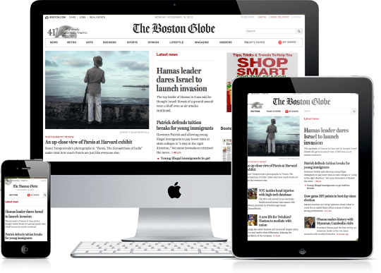
Responsive Web design
Before diving into tips and tricks to create responsive web design first we must know the meaning behind Responsive web design. The method or strategy by which we design a website that works perfectly on multiple devices is known as responsive web design, for ex- different screen sizes, resolutions, etc.
In today’s world, where everything is accessible in just a small mobile device, where you can connect to anyone around the world through the internet. And with the responsive design website, they can easily navigate and make the user experience better. It provides many options to the user regardless of the device they are using for example if a user has some visual defect the website will provide zoom-in or zoom-out and scrolling options, images, menus, etc.
There are so many things to know before creating responsive web design. So, without wasting time let's jump into some important tips and tricks that you should use to design your website to make it responsive and increase user engagement.
Tips and tricks for responsive web design
1. Fluid grid system
A fluid grid system is one of the most important parts to develop a responsive web design because it performs perfectly on a variety of devices with different screen sizes and resolutions. The fluid grid system is based on relative values, such as percentages, rather than fixed values, such as pixels or inches. This means that the layout of the page can be dynamically adjusted and scaled depending on the size of the viewport or the device it is being viewed on.

2. Image optimization
Nowadays image is coming in very big sizes and loading those images consume so much time, and memory so it's important that images are optimized for the web so that they load quickly and don't slow down the page. Optimized images have a smaller file size, which means they load faster than larger, uncompressed images. This can have a significant impact on overall page load time, especially for mobile users who may be using slower connections.
It also helps search engine optimization (SEO). Search engines like Google take page load time into account when ranking websites in search results. If your website contains slow-loading images, it can affect search results, which can negatively impact traffic and engagement.
Image optimization can also help reduce bandwidth usage and server load, which can save you money on hosting costs. By optimizing your images, you can reduce the amount of data that needs to be sent to users, which can help lower hosting costs.
So, you need to consider file size and image quality. While smaller file sizes are important to speed up page load times, you don't want to sacrifice image quality in the process. Finding the right balance between file size and image quality is key to successful image optimization.
3. Responsive Flexible typography
Responsive typography is a key aspect of responsive web design, allowing your website content to adapt to different screen sizes and devices without compromising readability or looks. With flexible typography, designers can create a smooth and seamless user experience that improves readability, accessibility, and usability.
Flexible typography will automatically adjust the font size, line spacing, and line spacing to fit the screen size of the device you're using to view your website. This means that the text remains legible and easy to read regardless of whether the user is viewing the page on a desktop or a mobile device. In addition, flexible typography allows designers to use a wider range of font sizes and styles without sacrificing consistency and uniformity.
And it is because it runs on relative units like em and rem rather than fixed units like pixels, which can be problematic when scaling across multiple devices.
Another important aspect of flexible typography is the use of variable typefaces, which allow designers to create more complex and dynamic typefaces with different weights, styles, and widths. Variable fonts provide greater control over the appearance of text and allow designers to adjust the weight and style of text to suit the context of the content. This is all you have to keep in mind.

4. CSS media queries
The most important tool of responsive web designing. This will allow designers to create a unique design that can place different screen sizes, resolutions, and orientations on different devices such as desktops, laptops, tablets, and smartphones. Media queries are used to apply specific styles to a webpage depending on the size and capabilities of the device used to view it. In this way, they allow designers to optimize the layout and presentation of website content for different screen sizes and devices, thereby improving the visitor's user experience.
Without media queries, a website would not be able to adapt its layout and content to different screens on different devices. This can result in a poor user experience as visitors may have difficulty reading content or navigating the site, which can lead to high bounce rates, lower engagement, and a negative impact on site conversion rates.
It also helps in rendering web pages mainly based on other device properties such as device orientation, resolution, or color depth. For example, a media query can be used to apply different styles to a web page that is displayed in portrait or landscape orientation to ensure the content is always optimized for the best viewing experience.
5. Responsive Navigation
Navigation is essential in responsive web design as it helps users find the information they need quickly and efficiently no matter what device they are using. Some tips:
Keep it simple: One of the most important things to consider when designing navigation for a responsive website is simplicity. Simple menus with clear labels allow users to navigate easily on a screen as small as a mobile device. A cluttered or complex menu can be frustrating and confusing for users and result in a higher bounce rate.
Consistency is key: Consistency is key when it comes to navigation. Make sure that the navigation is consistent across all pages of your site and that the positioning and look of the navigation are consistent across devices. This helps users become familiar with the navigation and reduces confusion.
Use hamburger menus: Hamburger menus are three horizontal lines that appear at the top of a website's navigation bar and, when clicked, expand to reveal the website's menu options. They are a popular choice for responsive web design because they take up less space on smaller screens and are easily accessible to users.
Using Icons: Icons are another useful way to make navigation easier, especially on small screens. Icons can be used to represent categories like a magnifying glass or a shopping cart. This can help reduce the amount of text on the screen and make it easier for users to navigate.
Real-time test on Multiple devices
Responsive web design is a design approach that allows websites to adapt to different screen sizes, resolutions, and devices. To achieve this, web designers need to test their design on multiple devices, including desktops, laptops, tablets, and smartphones.
Multiple device testing is essential to ensure your website design is functional and visually appealing across multiple devices. Here are some reasons why multiple-device testing is important in responsive web design:
Consistency: A responsive website design should be consistent across devices. Cross-device testing ensures the design is consistent and users get a consistent experience across platforms.
Performance: Performance is a key factor in designing responsive websites. Testing on multiple devices can help identify performance issues and optimize the design for each device's capabilities.
Ease of Use: A responsive website design should be easy to use and navigate across devices. Testing on multiple devices can help identify usability issues and ensure your design is intuitive and user-friendly.
Compatibility: The theme must be compatible with different web browsers and operating systems. The testing can help identify compatibility issues and ensure your project runs smoothly across platforms.
SEO: Responsive web design is essential for search engine optimization (SEO). Google's algorithm prefers websites optimized for mobile devices. By testing on multiple devices, you can ensure that your design is optimized for search engines
Conclusion
In conclusion, responsive web design is a crucial aspect of modern web development. Creating a website that can adapt to different screen sizes and devices is essential for providing a seamless user experience. To achieve responsive web design, it's important to consider factors such as layout, typography, and media queries. By following the tips and tricks outlined in this guide, you can ensure that your website is responsive and optimized for all devices. Remember to test your design thoroughly across different devices and browsers to identify and fix any issues. With a well-designed and responsive website, you can enhance the user experience and drive engagement and conversions.
 How to Turn Your Photos into Ghibli-Style Art with ChatGPT for Free
 Top 10 AI Tools for Plagiarism-Free Content Writing: Boost Your SEO & Digital Marketing Efforts
 The Rise of Graphic Designing in 2025: A Career Guide.
 The Rise of Video Editing: A Crucial Skill in 2025
 Top 10 Digital Marketing trends in 2025
 Common Mistakes in Digital Marketing and How to Avoid Them 2025
 The Future of Digital Advertising: What You Need to Know
 Social Media Marketing in 2024: Strategies for Maximum Engagement
 Building a Successful Digital Marketing Funnel: A Step-by-Step Guide
 5 ways to make money from home using AI (Artificial-Intelligence) in 2024


